- The Importance Of Rank Tracking Local Keywords In 2018 - June 5, 2018
- How to Spot Opportunities from your Competitors’ Backlinks - July 19, 2017
- Why You Should Monitor Your Brand Daily - May 26, 2017
A landing page is the first point of interaction that visitors make when they go to your site – whether through social media, an email promotion, or a paid ad. Nonetheless, some site owners rarely pay attention to where they direct their traffic. This, in turn, results in high traffic but low conversion rates.
Optimizing your landing pages can be the key to making visitors convert and getting a high ROI. But, how do you ensure that your landing pages are driving conversions?
Your Goals Should Be Clear from the Start

The common mistake that site owners make when it comes to their landing pages is directing all visitors to the homepage. The reason is simple: the homepage is full of information—it serves as the introduction to visitors. With so much information present on the homepage, visitors can become overwhelmed, which defeats the purpose of making them convert.
When visitors find the page is not delivering as what the ad or email campaign promised, they leave the site. Your goals should be clear from the start, and this should be reflected on your landing pages.
Your goals equate to the specific action you want visitors to take when they click on your email campaign, ad, or social media link. These could be:
- Making a purchase
- Subscribing to a mail list
- Completing a registration
- Contacting your business
- Filling out a survey
A/B Testing Should Be Part of Your Performance Metrics

How do you see which pages convert or perform the best? A/B testing provides you the starting point for comparisons in terms of landing page conversions. This does not only have to involve two page variants; you can actually run tests on multiple pages simultaneously.
The elements you need to test are:
- Page headline
- CTAs
- CTA buttons and designs
- Website copy
A/B testing makes it easier to create new pages with your target visitors in mind. The more tests you conduct, the more insights you can get on how visitors respond to your landing page.
Value Propositions Should Stand Out on the Page

You only have at most eight seconds to catch the attention of your visitors. Within those moments, you have to communicate your message to your visitor. If they can’t find what they’re looking for, they will leave the page. This is why you need to be clear with your value propositions.
Your value proposition should exhibit these two characteristics: relevance and clarity. The landing page should clearly articulate the value that you are offering to visitors. It should answer the following questions:
- Is there enough information about the offer?
- Does this meet the expectation of the visitor?
- What’s in it for the visitor?
Don’t drive everything home at once. Break the important features of your value proposition into parts. Use bullet points to highlight the main ideas of your value proposition—this also makes your copy easier to read and remember.
There is no one-size-fits all approach when it comes to landing page optimization. Every landing page should be unique to make sure conversions don’t fall short. As long as you focus on the experience of every visitor for every landing page you create, you can give your conversion rate a boost and enhance the overall performance of your website.

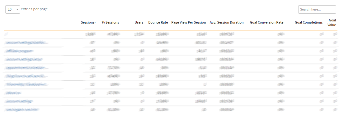
Behavior (Landing Pages) in Siteoscope Dashboard
Siteoscope can provide you with accurate metrics to determine which of your landing pages are driving conversions. We gather data from your site to show how your visitors respond to each of your site’s pages, so you know which area to tweak and improve.
Let Siteoscope provide you the data for your conversions. Sign up for a free trial and see how our streamlined dashboard monitors your website performance.
